
In everyday life, we are faced with at least one typeface everyday either it be on a college work sheet, an e-mail from your boss or a poster on the streets. We are surrounded by many different typefaces, either it sans-serif, serif, script or a decorative style font, but what makes a good font face and what makes a typeface timeless? A well crafted typeface is something that "look right at home no matter what century we’re in" (25 classic fonts). In this blog post, I will post a few of the many timeless typefaces that have been created a long time ago, but are still well known and used in today's society.

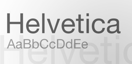
The first typeface we will be looking at is Helvetica. This sans-serif based typeface was originally designed by Swiss designers Max Miedinger and Eduard Hoffmann back in 1957. There aim was to produce a typeface that was "Faceless and timeless" (Creative, pge 337), which they successfully did. The first name of this typeface was called Neue Haas Grotesk though was changed to Helvetica two years later (1960). This font is definitely the most recognized font internationally and has been used for over 5 decades. I have started seeing this font being used in either bold or ultra light on a lot of new, young graphic designers on the internet, and this font has become part of a new trend in the internet world with graphic designs. All in all, a faceless font indeed, but I don't see this font dying down anytime soon.

The next font I will be looking at is GillSans. This sans-serif based typeface was designed by sculptor turned typographer, Eric Gill in 1926. This font is known the most for it's signage in the London Underground, which it was originally first designed for back in 1916. Though, around that time, was only a typeface with capital letters. The typeface was fully finished in 1927 after Gill got professional help via Monotype, back then a well known typographic company. This typeface is yet another timeless typeface which looks a bit more stylized than Helvetica, but is still a bit faceless in a way.

The last typeface that I will be talking about is Optima. Optima is a German typeface designed by Hermann Zapf back in 1950. This typeface is described as "a sans-serif font on a low calorie diet" (25 classic fonts) as the letter forms start off bold but then thin down and expand and the ends. This font has been used for almost anything, from book text to signage, as it is such a multi-purpose font. This font is a very versatile font to use, and I personally adore this font because I can use it either for a formal letter or a web design.
Resources.
Blog Spoon Graphics. (2009). Retrieved May 27 2010, from http://www.blog.spoongraphics.co.uk/articles/25-classic-fonts-that-will-last-a-whole-design-career.
De Jong, C., Purvis, A. & Friedl, F. (2005). A Sourcebook of Classic and Contemporary Letterforms, Creative Type. London, England.
Blog Spoon Graphics. (2009). Retrieved May 27 2010, from http://www.blog.spoongraphics.co.uk/articles/25-classic-fonts-that-will-last-a-whole-design-career.
De Jong, C., Purvis, A. & Friedl, F. (2005). A Sourcebook of Classic and Contemporary Letterforms, Creative Type. London, England.
No comments:
Post a Comment